A brand is a system,
not a file
The logo is the piece people see first and the one that matters least. What decides whether a company looks serious is the system: colours with verified contrast, a type scale, and rules your team can apply on their own to a quote at eight in the evening.
brand --check contrast
text on dark ........... 11.7:1 AAA
text on accent ......... 5.1:1 AA
accent on background ... 4.9:1 AA large
[ok] no pair below the legal minimum
brand --export
logo, palette, scale, manual: one folder
waiting
$ open fymera-identita
Non ti consegniamo un logo.
Ti consegniamo il file aperto
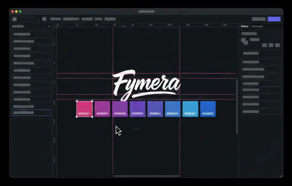
Un marchio è un sistema: l'aria attorno al segno, otto passi di colore con un nome, una scala tipografica, contrasti misurati. Scorri: si costruisce davanti a te.
-
01
La tela prima del segno
Si comincia da cosa deve fare, non da come deve sembrare. Un marchio disegnato prima di sapere dove finirà si rifà, e si rifà a spese vostre.
-
02
L'aria attorno
Quanto spazio libero deve restare intorno al segno, e sotto quale misura non si scende. Sono le due regole che impediscono a chiunque di rovinarlo senza volerlo.
-
03
Otto passi, non una sfumatura
Il gradiente della firma è una sequenza di valori esatti, da #F033A1 a #3261EC. Si riproduce, non si improvvisa — ed è per questo che due stampe fatte a un anno di distanza escono uguali.
-
04
Colori con un nome
«Rosa segnale», non «quel rosa lì». Un colore con un nome e un compito scritto accanto viene usato al posto giusto anche da chi non c'era quando è stato scelto.
-
05
Contrasti misurati
Ogni accostamento ha il suo rapporto scritto. Il nostro rosa su bianco fa 3,4:1 e non passa: sta scritto nel manuale, così nessuno lo usa per un testo e nessuno deve accorgersene dopo.
-
06
Il file che resta
Alla fine ricevete questo: i livelli, le guide, i valori, e le regole in una lingua che il vostro team applica da solo. È la differenza fra un logo e un'identità.
// when you need it
The signs your brand
is working against you
Rebranding because "it looks dated" is the worst reason there is. These, on the other hand, are the cases where not doing it costs you.
- 01 Every quote that leaves the office uses a different typeface, depending on who wrote it
- 02 The logo only exists as a JPEG, and nobody can find the original file
- 03 On social, on the site and on the signage you look like three different companies
- 04 Your brand colours fail readability checks on the website
- 05 New hires take weeks to work out how a company message is supposed to read
- 06 You are about to launch something and realise there is nothing to hang it on
// what we deliver
Four pieces your team
can use without us
An identity that needs the designer every time is not an identity: it is a dependency. These four pieces exist to remove it.
-
01
The mark and its variants
Horizontal, stacked, monogram, positive and negative, in vector. With minimum sizes and clear space: the two rules that prevent ninety per cent of misuse.
-
02
A verified palette
Colours chosen for contrast as well as for taste. Every text-on-background pair is measured: anything below the minimum does not enter the palette, rather than entering it and causing problems later.
-
03
A type scale
A small number of sizes, defined and named. Whoever lays something out picks from six values instead of inventing a new one each time, and that is how twenty documents come to look like one company.
-
04
Real applications
Not mockups on a brick wall: email, quote, deck, signage, social post. The things you actually go out and do, already set up.
// how we get there
Few directions,
taken far
We do not present twelve logos to choose from: we present two or three directions developed far enough to be judged. Choosing between twelve sketches is a lottery.
Listening and positioning
01What you sell, to whom, and what your competitors are saying. A brand is judged inside its market: beautiful in the abstract means nothing.
Two or three directions
02Developed on real applications, not on a white background. That is where you see which one holds up and which was just a nice shape.
Building the system
03Palette with measured contrast, type scale, grids, usage rules. The least spectacular part, and the part you keep.
Handover
04Source files, a manual, and an hour with the team who will have to use it. A manual handed over and never explained never gets opened.
$ ./brand --token
One colour lives in five places.
Change it and all five change
This is what you buy when you buy an identity: not a file, but a set of named decisions your team applies without calling anyone. Hover over a piece and watch where it lands.
$ cat stack.json
What we build it on
- Figma A component and token system: the manual stays alive instead of ageing as a PDF
- Design tokens Colours and measurements with names, reusable identically across site, documents and app
- WCAG contrast Every text-on-background pair measured: what fails does not enter the palette
- Vector The mark in SVG and PDF: printed two metres wide without a pixel showing
- Type scale A few named sizes instead of twenty measurements picked by eye
- Usage manual The rules that genuinely matter, in a few pages people will actually read
$ ./domande --frequenti
The questions that
always come up
What does an identity cost?
It depends how much system you need: a mark with its variants is one thing, a full system with applications and a manual is another. We give a number after the listening phase, once it is clear what you will actually have to apply.
Can we use the logo anywhere?
Yes: the mark and its source files are yours, delivered in vector, and you can use them without asking anyone. It is the one piece of our work you own outright, and we want that to be unambiguous.
How long does it take?
Four to eight weeks for a complete system. The long part is the decisions, not the drawing: if the decision-makers are available, the timeline genuinely shortens.
Can we keep our current logo?
Often yes, and sometimes that is the right answer: if the mark works and the problem is that there is no system around it, we build the system and you spend a fraction. We say so after the listening phase.
Why does contrast matter so much?
Because text nobody can read communicates nothing, and because since 2025 digital accessibility has been a legal obligation for a growing band of companies. Checking afterwards means redoing the palette: checking first costs nothing.
Do you do naming as well?
Yes, when it is needed, and it is a job in its own right with its own timeline: availability checks against trademark registers and domains have to happen before anyone falls in love with a name. If the name already exists, we start from the mark.
fymera init --project "yours"
Show us how you
present yourselves today
Thirty minutes on video with one of your quotes and one of your posts in front of us. If the mark holds up and only the system is missing, we will tell you.
